Activation is not
configuration.
A strategy to increase brand activation rates at Dropi
Of every 100 brands that registered on Dropi, fewer than 20 ever became active.
An 80%+ loss of potential ecosystem value. Not from a product that doesn't work, but from an experience that fails to communicate why it matters. This case study documents how I approached that problem.
Before assuming causes, I had to live it.
Before proposing anything, I went through the registration flow as a new brand. The frustration wasn't theoretical. It was structural.
“Why does every step open a new tab? Am I outside the app?”
“What does activation mean? Can't I start selling right now?”
“I got the welcome email, but it doesn't feel like one. It's just plain text.”
The problem has a name. Two, actually.
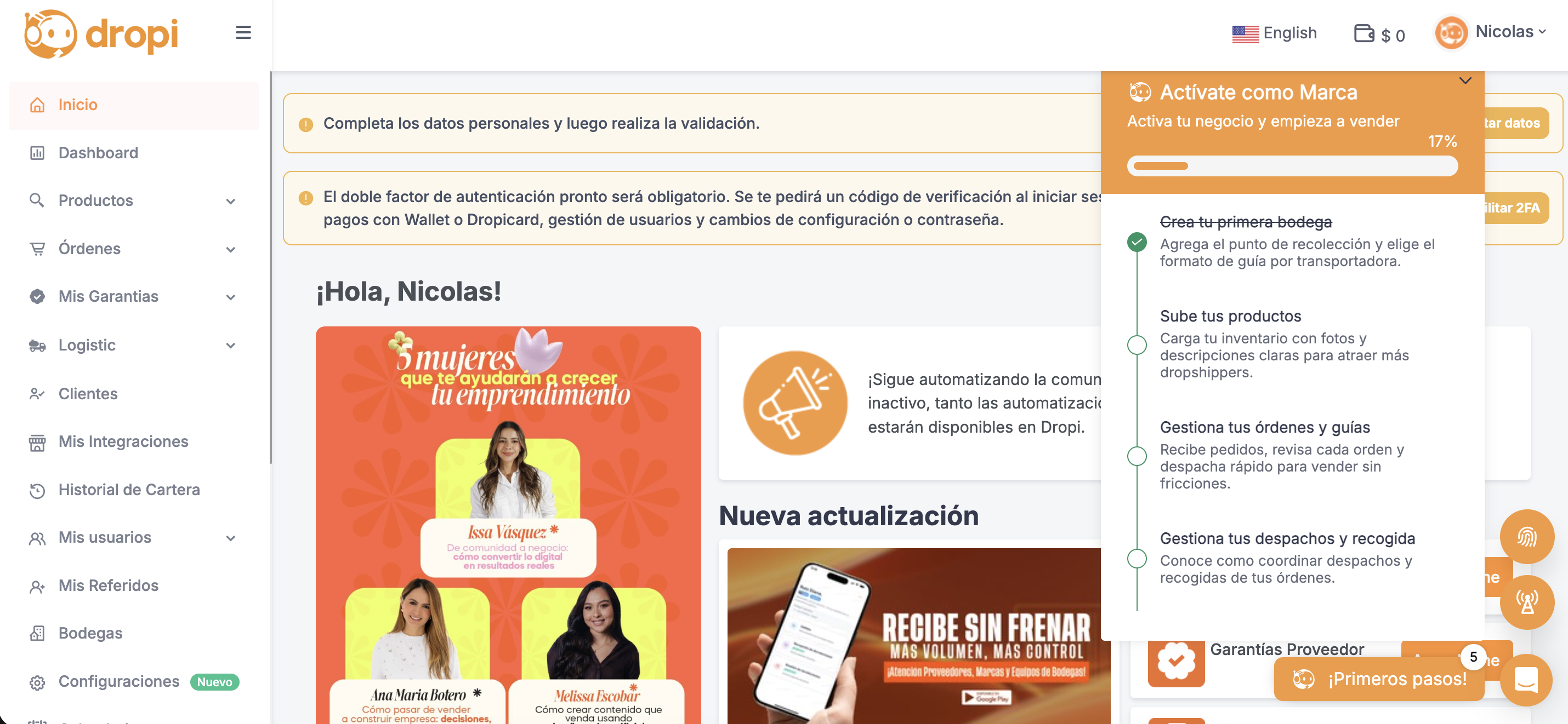
Onboarding
What happens in the first few minutes. Modals, preferences, welcome screen. It exists, but it doesn't prepare the user for what comes next.
Activation
The real process: 6 steps, 45 fields, 40–50 minutes. Presented as one continuous task when it should happen across 4 separate moments, each triggered by a real business event.
The story of every brand that never came back
Six steps. A steady emotional decline. Not a single moment of return.
| # | Stage | Action | Thought | State |
|---|---|---|---|---|
| 1 | Discovery | Sees an ad, arrives at Dropi with expectations | "This sounds good, I want to start selling" | 😊 Hopeful |
| 2 | Registration + onboarding | Completes preference modals | "I guess at the end of this I can sell" | 😐 Neutral |
| 3 | Finds the checklist | Sees 6 steps with no context for why | "Do I have to do all of this before I can sell?" | 🫥 Shocked |
| 4 | Tries to complete | Opens new tabs, fills 45 fields | "When will I actually be able to sell?" | 😤 Frustrated |
| 5 | Abandons or pushes through | Closes the session. Doesn't return | "Maybe this isn't for me. Maybe another app" | 😞 Exhausted |
| 6 | Randomly checks email | Dropi comes to mind again, but with no value | "OK… that's it?" | 🫤 Disappointed |
The problem isn't the product.
It's when and how we ask the user to trust us.
Dropi's activation rate is below 20%. The SaaS average is 37.5%. The gap isn't in the features, it's in the time to first perceived value.
75%
of users abandon a product in the first week if onboarding doesn't meet their expectations.
Source: Nielsen Norman Group
3×
more likely to be retained: users who experience core value within 5 to 15 minutes vs. those who wait more than 30 minutes.
Source: Amplitude, via SaaSFactor
3×
more abandonment in products with a time to first value over 30 minutes vs. those that deliver it in under 10 minutes.
Source: Reforge, via SaaSFactor
What the platforms that actually activate users do well
| Shopify | Tiendanube | Dropi (current) | |
|---|---|---|---|
| Steps before first value | 2 | 3 | 6 |
| Does step 1 generate visible value? | ✅ | ✅ | ❌ |
| Segmented post-registration communication? | ✅ | ✅ | ⚠️ |
| Quick win in under 15 min? | ✅ | ⚠️ | ❌ |
| Does the aha moment happen in the first session? | ✅ | ✅ | ❌ |
That's why I split this strategy into 4 moments, each activated with precise timing, responding to a real business event, not an arbitrary calendar.
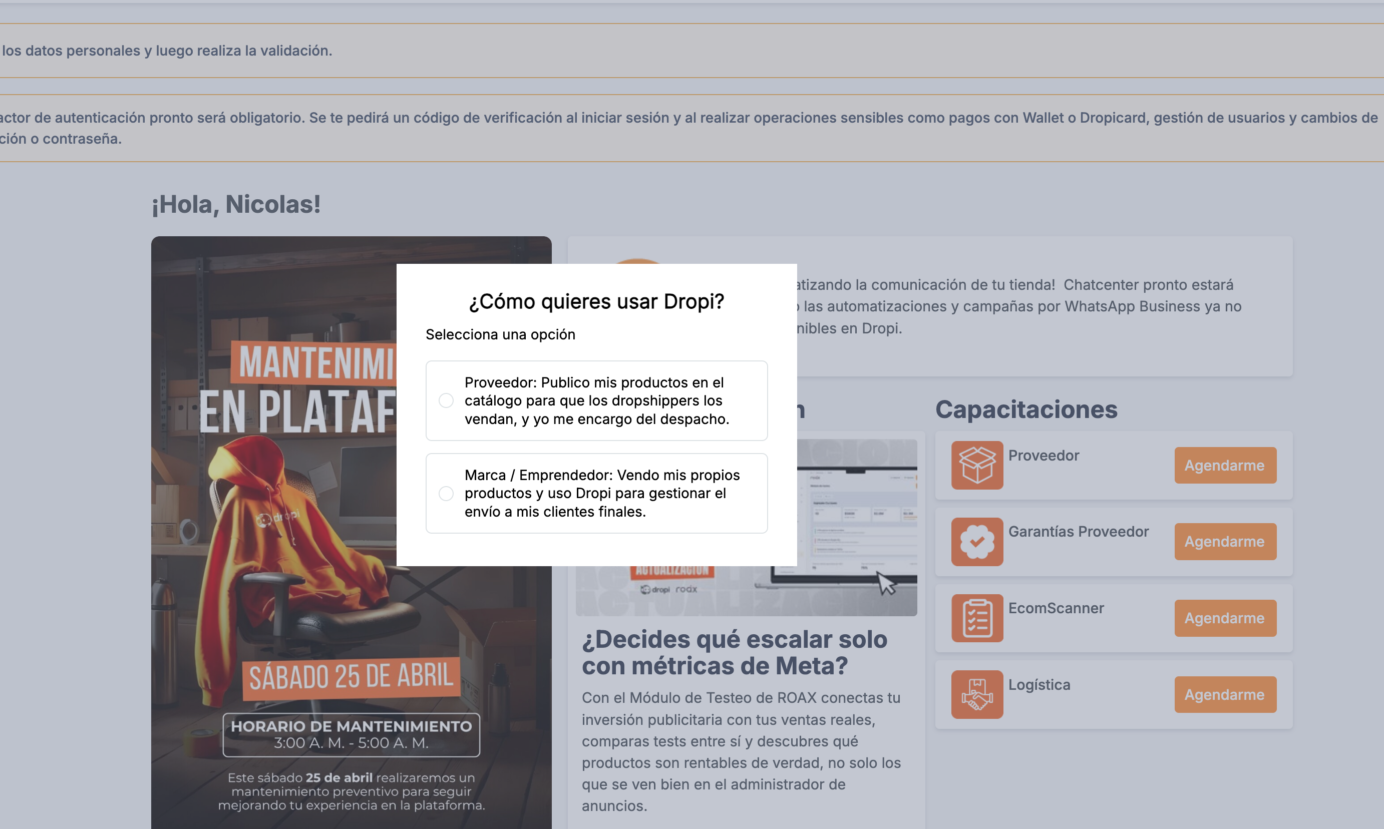
Key question: How do I give the onboarding the brand's personality, so it doesn't feel like a generic sequence?
Before
Generic modal. No context, no visible consequence.
After
3 questions + real-time preview. The brand comes to life before the first form.
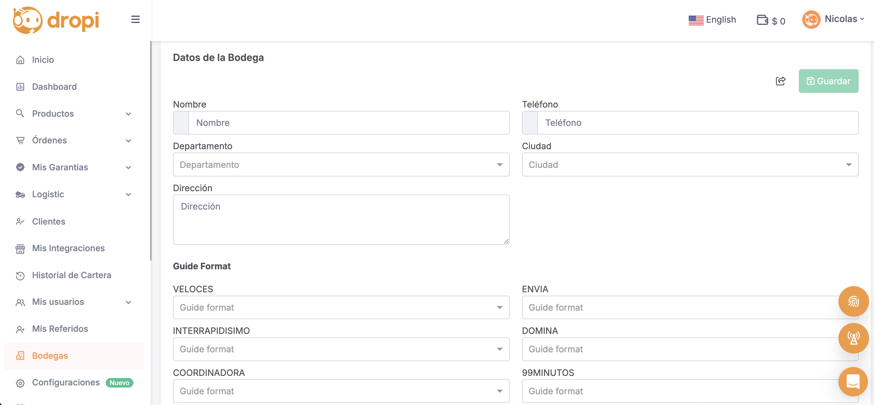
Key question: What are the minimum viable steps to give the user something in return as quickly as possible?
Before
Warehouse and product lived in separate tabs, after onboarding, with no guidance.
After
Activation no longer starts after registration. It's part of it.
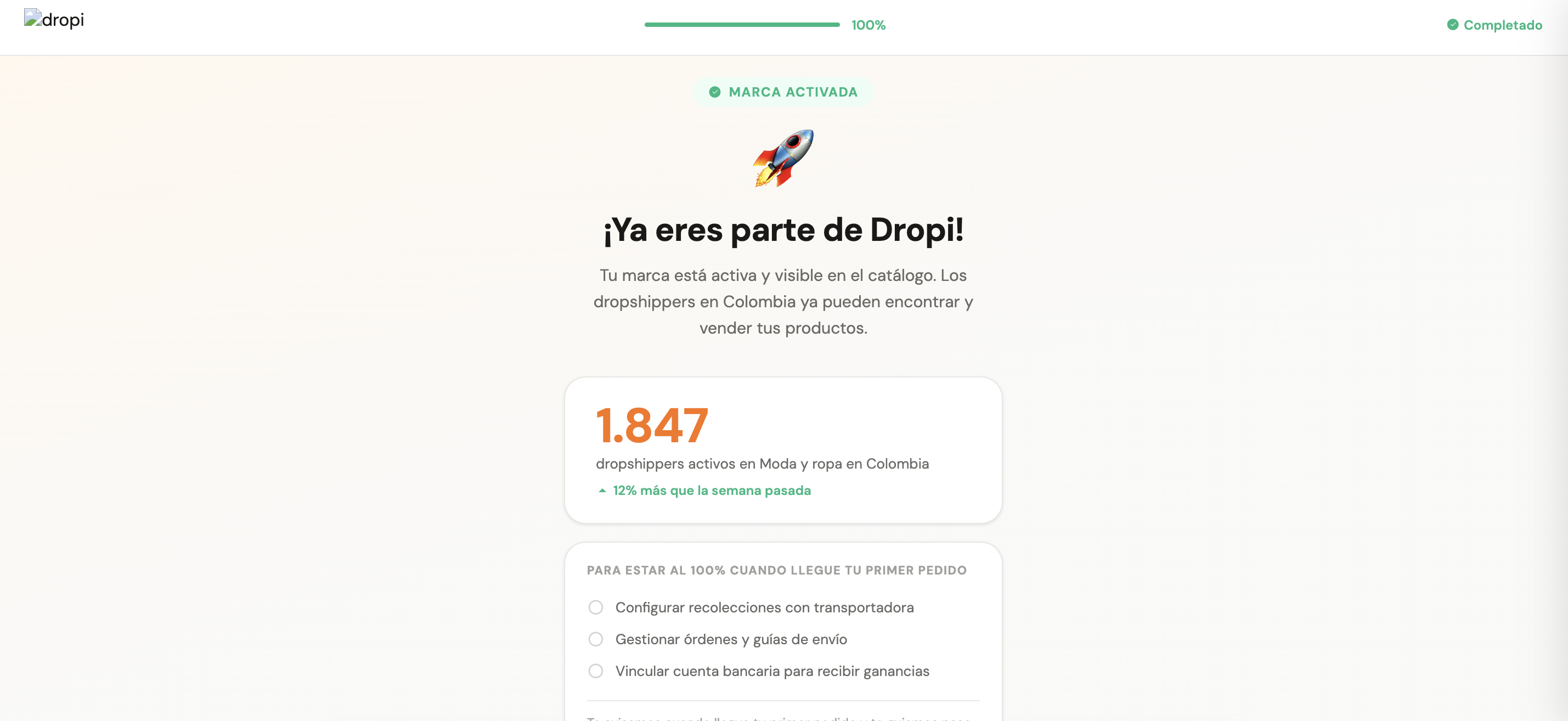
Key question: When does the user first understand that Dropi is a real network, not just another platform?
Before
The user completes 6 steps and receives no signal that anything changed. They don't know if anyone can see their products or whether the effort was worth it.
After
Immediately after publishing their first product, they see in real time how many active dropshippers are in their category.
Key question: When is the right moment to ask for what's still missing?
| Trigger | Unlocks |
|---|---|
| First order received | Manage order and pickup |
| First dispatch confirmed | Bank account validation (earnings waiting) |
Goal: Run a parallel email series that doesn't feel like spam.
How: 7 emails with triggers based on real user behavior, not an arbitrary calendar. Each email responds to a specific action or inaction by the user.
| Trigger | Timing | |
|---|---|---|
| E1: Welcome | Registration completed | Day 0 |
| E2: Onboarding abandoned | Onboarding incomplete | +2 hours |
| E3: Market opportunity | No product published | Day 1 |
| E4: Product visible | First product published | Event |
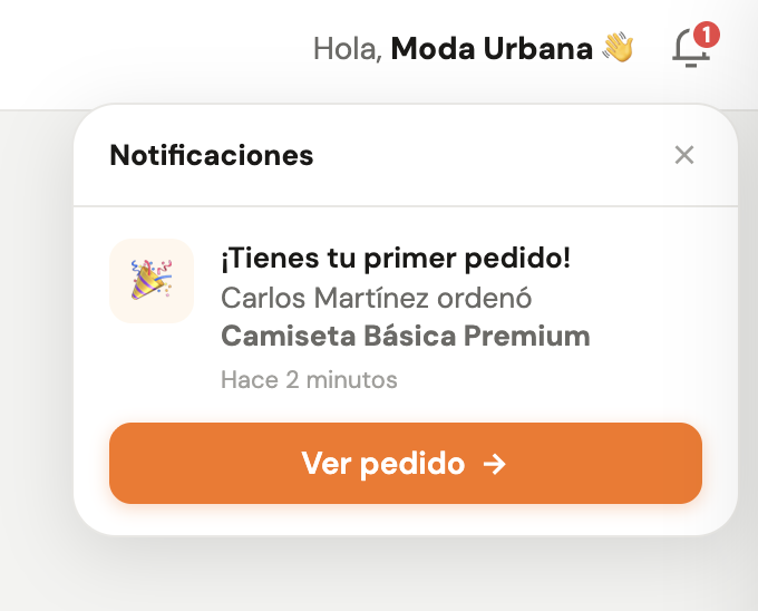
| E5: Your first order! | First order received | Event (push + WhatsApp + email) |
| E6: Success story | Active brand with no second order | Day 7 |
| E7: Human support | No sustained activity | Day 15 |
Interactive prototypes
Functional HTML prototypes, not static mockups. Each demo is interactive and runs directly in the browser.
Brand Activation Flow
Complete prototype with 9 screens: profile selection, warehouse setup, first product upload, the aha moment, and the first order dashboard.
Email Sequence: 7 activation emails
Complete email marketing set for the post-registration re-engagement sequence: from the welcome email to recovering users who abandoned onboarding.
Impact Measurement Framework
Activation timeline
| Milestone | Moment | Key metric |
|---|---|---|
| 5 min | Onboarding | Completion rate >80% · Time to complete <5 min |
| 15 min | Warehouse + product | Time to first value <15 min · % of users who publish a product |
| 24 h | Aha moment | CTA click rate on the panel · % of users who return within 48h |
| 7 days | Re-engagement | Email open rate · CTA click rate · Conversion rate |
Funnel comparison: current vs. projected
| Stage | Current funnel | Projected funnel |
|---|---|---|
| Registration | 100% | 100% |
| Onboarding complete | ~65% | ~90% |
| First product published | ~40% | ~75% |
| Aha moment | ~25% | ~55% |
| Activation at 7 days | <20% | ~37.5% |
Project Leadership Plan
3-month roadmap
Goal
Validate hypotheses with minimal effort. Understand the user before touching a pixel.
Deliverables
Research validation · Tracking plan · Prototype M1 · Prototype M2 · Usability tests
Moments
M1 + M2
Teams
KPI
Validated hypothesis + tracking live
Goal
Connect the full flow and start A/B Test against the current experience.
Deliverables
Prototype M3 · Integration M1+M2+M3 · Real-time metrics dashboard · Front-end handoff · Email design
Moments
M3
Teams
KPI
New flow in production + A/B Test running
Goal
Close the system with event-based triggers and validate test results.
Deliverables
Moment 4 (emails + push + WhatsApp) · Event triggers · A/B test analysis · Iteration by findings · Documentation
Moments
M4
Teams
KPI
Activation measured vs. baseline + iteration plan
What this project demonstrates
Research before pixels
The 5 Whys findings and competitive benchmarks defined the structure of the 4 moments. The screens are a consequence of the analysis, not the other way around.
Strategy from constraints
Not touching business logic or backend infrastructure required a more creative solution: separate activation into real events instead of inventing new features.
Anticipating the hard questions
The 'pending logistics configuration' state when a first order arrives without a carrier set up isn't a UX detail. It's an operational decision that requires alignment with engineering and business stakeholders.
Designing for a number
The goal was never 'redesign the onboarding.' It was to move activation from 20% to 37.5%. Every decision traces back to that number.